Q
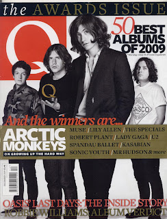
Main focus is the band, of which the singer/guitarist is at the front, and drummer is at the back. A common convention in group shots of bands. Also, the band is in black and white, (except the Q award, which is gold) this, with the lack of a background, keeps the colour scheme simple; red, white, black and gold. If too many colours were used the picture would not mesh and the magazine would not look visually appealing. the golden Q stands out as to draw focus, as it is relative to the main theme of the issue; the Q awards.
The name of the magazine; Q, is printed in a large white font in a red box. The red helps the title to stand out as it is the largest amount of the colour on the page with only a few other sentances in red.
There are two banners; one at the top and one just under half the way down. The top banner says; "the awards issue", the main feature of the magazine as opposed to the bigger banner lower down that goes into more detail about this subject, listing names of artists and bands who are "the winners", with "arctic monkeys" in a larger font. these stand out and are intended to get people to buy the magazine if they are fans of one or more of the mentioned artists or interested in the subject.
(Q used to be called cue but the name was changed to avoid any confusion with the sport of snooker)
No comments:
Post a Comment