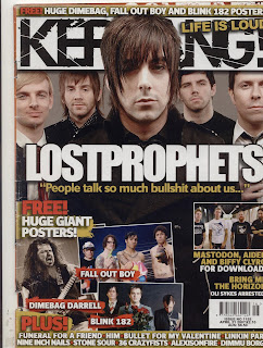
 Again the lead singer of the band featured on the cover is most prominent and in front of the rest of the band members. Their colour scheme is simple, all wearing black and white (except one red tie) but unlike Q they are in colour. The colour scheme is, like Q: red, white, black and gold. however it is a much darker cover with a background of grey and black being the most prominent colour.
The Masthead is behind the lead of the lost prophets but infront of the other band members with the tagline "Life is loud" in gold, over the shattered, black "kerrang" on a white banner. The word kerrang is shattered supposedly to represent how glass is shattered by noise. There is another gold banner above the masthead, a red "free!" followed by a list of white text band names featured in the free posters. The word "FREE!" is also on one of the cover lines, in red, standing out next to the white text of the rest of the cover line, again referencig the free posters, this time with picturse of the bands.
Below this is a red "PLUS!" over a banner with several band names. The words free and plus are convincing words for someone to buy a magazine, free as people enjoy free things and plus suggests something extra.
No comments:
Post a Comment